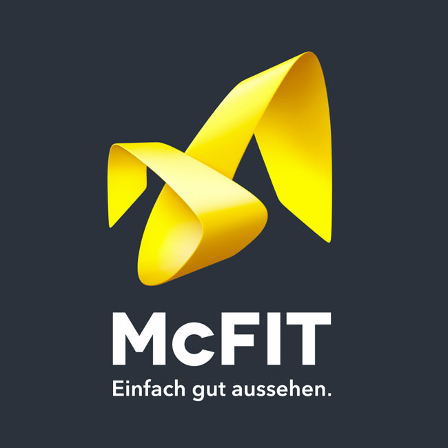
The discount fitness chain McFIT has given itself a makeover. In the past, a bright yellow mascot in the form of a banana adorned the blue lettering, now a yellow bow on an anthracite-colored background is skilfully looped into one another, thus forming an abstract structure. The FDP colors blue and yellow give way not only to the logo, but also to all other McFIT brand print items.
I doubt whether my spontaneous association with towels is intended by the makers of the syndicate agency. Still, I see the logo as a bold move. The mysterious is just interesting. The fact that everything has been thought of can also be seen in the adaptation of the spelling from “McFit” to “McFIT” - probably to put the logo on a wide base.
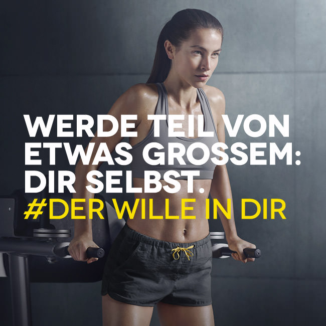
the fitness chain generally wants to move away from a cheap to a premium image - in line with the new McFIT experience training offers. in addition to the complete corporate identity, the price was also changed and increased by 3.00€ overnight. after all, you can now shower for free.
also worth mentioning is the new twitter campaign - in which a small but momentous faux pas happened to the marketing team. the hashtag #derwilleindir is presented with spaces (probably for better readability) on various posters. the problem: more and more tweets with hashtag #der are appearing now. embarrassing, embarrassing.