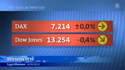
I closely follow the design of various programs on German television. Hardly any program retains its corporate design permanently. The evening ritual of the meeting in front of the television screen at 10:15 p.m. on the topics of the day has been causing me stomach ache lately: For some months now, a completely confusing color scheme has been chosen for the presentation of the current stock exchange prices.

the red background of the two bars is always the same - i have never seen a day when it was green. indicators for the daily development of the shares are also not the smaller arrows to the right of the stock price (a constant or falling price is visualized with a green arrow). the only explanation that would justify the red bars would be a long-term negative development (which is also not the case with the DAX, for example, in recent years). my plea: in the course of redesigning the design of the broadcast, those responsible should then also revise the presentation of the stock market data straight away.